MENU

Sections

  • About Us
    • Editors and Writers
    • Sponsorship Terms & Conditions
    • Code of Ethics
    • Sign Up for Cambridge Spy Daily Email Blast
  • The Arts and Design
  • Culture and Local Life
  • Food & Garden
  • Public Affairs
    • Commerce
    • Health
    • Ecosystem
    • Education
    • Senior Nation
  • Point of View
  • Chestertown Spy
  • Talbot Spy

More

  • Support the Spy
  • About Spy Community Media
  • Advertising with the Spy
  • Subscribe
December 30, 2025

Cambridge Spy

Nonpartisan and Education-based News for Cambridge

  • About Us
    • Editors and Writers
    • Sponsorship Terms & Conditions
    • Code of Ethics
    • Sign Up for Cambridge Spy Daily Email Blast
  • The Arts and Design
  • Culture and Local Life
  • Food & Garden
  • Public Affairs
    • Commerce
    • Health
    • Ecosystem
    • Education
    • Senior Nation
  • Point of View
  • Chestertown Spy
  • Talbot Spy
00 Post to Chestertown Spy Arts Looking at the Masters

Looking at the Masters: Christmas with Grandma Moses

December 25, 2025 by Beverly Hall Smith
Leave a Comment

Christmas with Grandma Moses

Anna Mary Robertson Moses (1860-1961) began painting at age 78. Her paintings of bygone American life were discovered in 1938, and her popularity continues to this day.

“Grandma Moses” (1953)

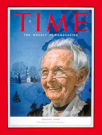
The Time Magazine cover on December 28, 1953, featured a portrait of Grandma Moses painted by Boris Chaliapin, along with the text “Christmas is not just one day.”  Her smiling face was set in front of a snowy winter landscape with a church in the background. Moses painted all the seasons of the year and hundreds of scenes of farm life in rural America where she grew up. Among her 2000 paintings are celebrations of Christmas. She once wrote, “I forget everything, everything except how things used to be.” 
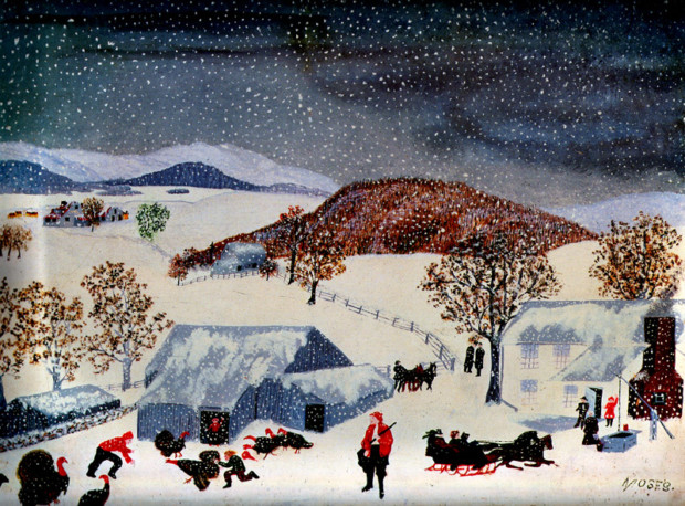
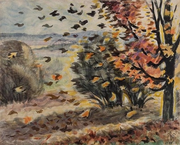
“Let Me Help”

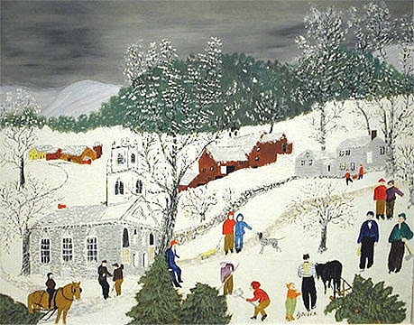
Winter snow scenes were among Moses’s favorites, especially at Christmas. “Let Me Help” is a depiction of the community gathering to help cut Christmas trees for the nearby church, and perhaps for the farm house up the road. There are at least three trees down. In the left corner a horse and rider pull a cut tree into the scene. In the center foreground, two figures cut down a second tree. A third tree already has been cut and roped to a horse for transport. The scene includes gaily dressed villagers, some talking, a pair with a sled and a dog, and a pair with an axe. In the distance, a barn, snow-covered trees, an evergreen forest, and the cold winter sky complete the scene. As always, Moses painted a joyful and peaceful memory of days gone by.

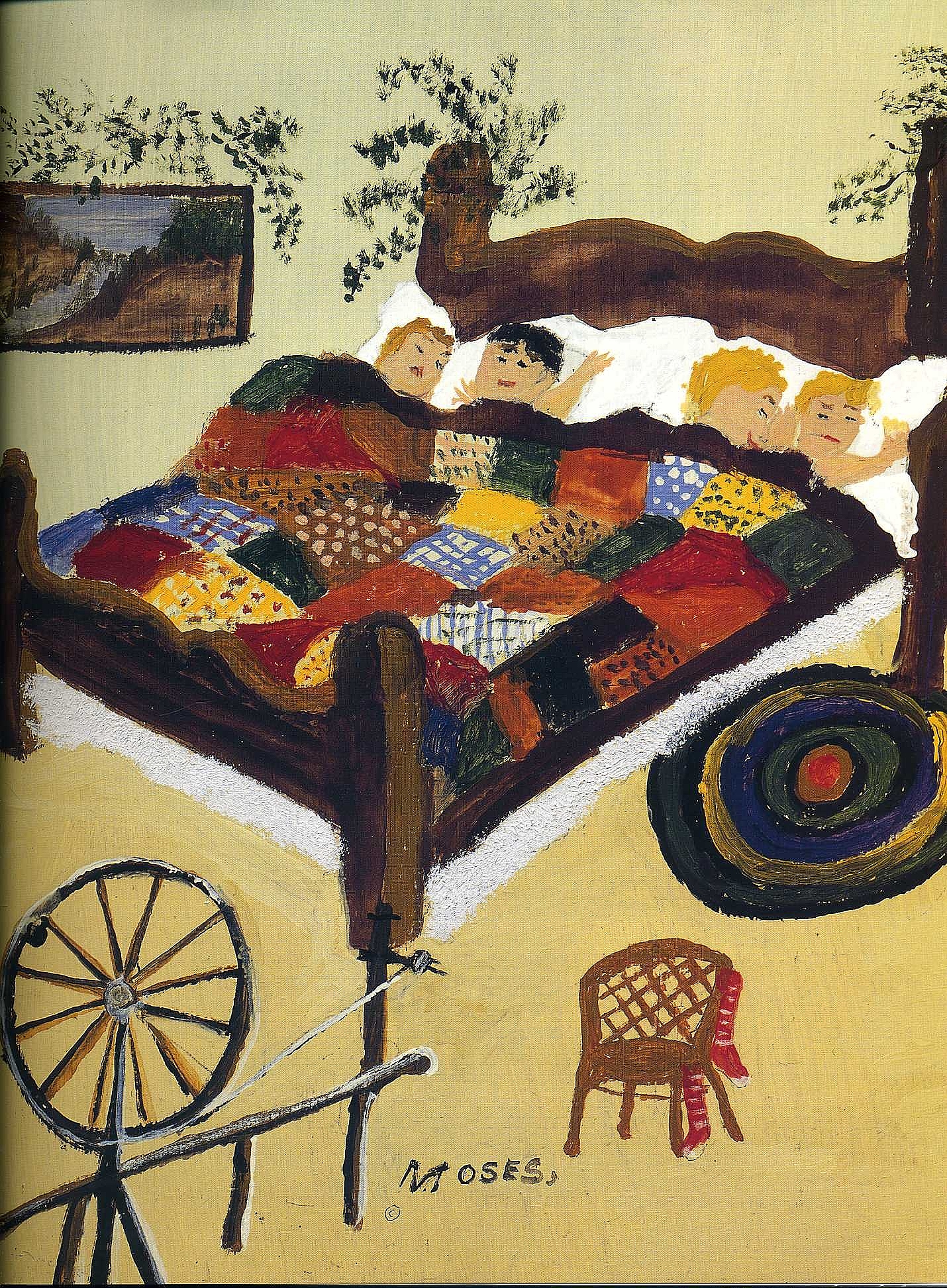
”Waiting for Christmas” (1960)

Waiting for Christmas” (1960) is an unusual painting for Moses. It is a close-up view of a bedroom in which four children are all nestled together in the heavy wood bed. They are covered with a “charm” quilt made with random shapes and no pattern. These quilts were popular in the 1870s and often contained fabric from other items used in the household. Fabrics were traded among quilt makers to obtain as many different designs as possible. Three of the children are asleep, but the child with dark hair and eyes is awake, waiting for Christmas. The head board is decorated with greens. A rumpled round woven rug is on the floor.  Two red stockings are hung on the small wicker chair. A spinning wheel is set in the lower left corner of the scene. 

Moses typically painted landscapes, and she used bright colors everywhere. The landscape in this painting is in a frame and hangs on the wall. 

“Here Comes Santa Claus” (1948)

Moses’s Christmas images became so popular they were used on Christmas cards, other greeting cards, jam jars, curtains, and postage stamps. Hallmark sold 16 million Moses Christmas cards in 1947.  “Here Comes Santa Claus” (1948) (15”x23”) is one of several paintings on this theme. The full moon lights up the snowy scene. Bright stars fill the deep blue sky. Moses painted from the sky down. Tall snow-covered trees link earth and sky. Down from the sky to the cozy house comes Santa Claus in his sleigh drawn by eight reindeer. Delightful.


KRI7286740 Down the Chimney He Goes, 1960 (oil on pressed wood) by Moses, Anna Mary Robertson (Grandma Moses) (1860-1961); 40.6×60.3 cm; Private Collection; (add.info.: Illustration for The Night Before Christmas by Clement C. Moore); Kallir Research Institute/© Grandma Moses Properties Co.
Please note: This photograph requires additional permission prior to use. If you wish to reproduce this image, please contact Bridgeman Images and we will manage the permission request on your behalf.


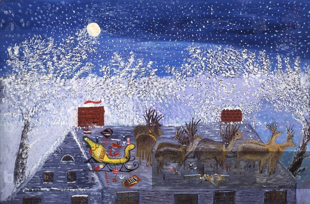
The same sky, stars, and trees are present. Moses features the roof top of the house on which Santa has parked his decorated yellow sleigh filled with packages. Some spill onto the roof. She manages to get all eight reindeer on the roof. Looking closer, the viewer can see a small section of Santa’s red suit sticking out the left chimney. 

Grandma Moses was 100 years old on September 7, 1960. Governor Nelson Rockefeller declared her birthday, Grandma Moses Day. Life magazine published a photograph of her on its cover on September 19, 1960, with wishes for a happy 100th birthday.   

“So Long till Next Year” (1960)

“So Long till Next Year” (1960) is a depiction of the end of the story as Santa waves to the viewer from his sleigh as he and his reindeer fly back to the North Pole. The landscape, including the trees, the house, and the sky, is repeated. This painting is one of the 25 Moses completed during the last year of her life. She would paint for five hours, and without an easel, in the kitchen or bedroom. She said, “I’ll get an inspiration and start painting: then I forget everything, everything except how things used to be and how to paint it so people will know how we used to live.”


Wishing everyone the very best of holidays.


Beverly Hall Smith was a professor of art history for 40 years. Since retiring to Chestertown with her husband Kurt in 2014, she has taught art history classes at WC-ALL and the Institute of Adult Learning, Centreville. An artist, she sometimes exhibits work at River Arts. She also paints sets for the Garfield Theater in Chestertown.

The Spy Newspapers may periodically employ the assistance of artificial intelligence (AI) to enhance the clarity and accuracy of our content.

Filed Under: 00 Post to Chestertown Spy, Looking at the Masters

Looking at the Masters: Edvard Munch

December 18, 2025 by Beverly Hall Smith
Leave a Comment

Expressionist painter Edvard Munch (1863-1944) was born in Loten, Norway. He perhaps is best known for “The Scream” (1893), a painting that reveals his anxiety, alcoholism, and depression. He was weighed down by family members’ deaths when he was very young. Additional factors were his poor health and his father’s religious zeal and harsh discipline. As an expressionist he almost always chose emotion over realism.  Munch also painted many portraits and landscapes. He spent his life in Norway, with trips to Paris and Germany. 


“Winter in the Woods, Nordstrand” (1899)

This article on Munch’s lesser-known landscapes, winter settings in particular, explores a unique side of his work. By the time “Winter in the Woods, Nordstrand” (1899) (24”x 35”) (oil on cardboard) was painted, Munch had become known internationally. From 1899 through 1901, he painted several winter landscapes of the fjords at Nordstrand, south of Oslo. The setting of this piece is a dark spruce forest in the snow. No people are present, but footprints in the snow indicate that people recently had come this way. The heavy clumps of snow on the trees are fresh. The wind has not yet dislodged them. Munch used thick strokes of paint, but he let the tan cardboard show through in places. Like the Impressionists, whom he admired, he painted shadows in shades of blue. However, he also had a heavy hand with black. He was creating his personal style. 

The painting, often described as melancholy, is a close-up view of the forest, the sky not included in the scene. But the sun shines across the exposed ground and causes the snow to glow. Munch depicted nature as raw and powerful with his use of broad sweeping brushstrokes. He explained, “Painting picture by picture, I followed the impressions my eye took in at heightened moments. I painted only memories, adding nothing, no details that I did not see. Hence the simplicity of the paintings, their emptiness.”

“White Night” (1901)

In winter in Norway, “polar night,” the scientific term for the phenomena, occurs when the Sun remains below the horizon. The title of the painting, “White Night” (1901) (45’’x44”), actually refers to the same phenomenon that occurs during the summer. The whiteness of the snow prevents the winter polar night from becoming completely dark. Munch painted the dark silhouette of the trees in the foreground, the snow and tree shadows in the middle ground, a tan barn with a snow-covered roof, another stand of spruce trees, and the swirling waters of the fjord and coast in the distance. The sky is sunless, but not dark.  Munch’s use of black and cool blue colors produces the chill of the scene. Not at all depressing, the work is an expression of the beauty, power, and vast scope of nature’s many attitudes.


“Winter Landscape” (1901)

Munch painted numerous winter scenes, and like music, they are a theme and variations. “Winter Landscape” (1901) (32”x48”) focuses more on the field of white snow and the blue shadow cast by the spruce tree. Large red, brown, and black rocks stand out against the white snow. A row of shorter and taller trees in the distance also calls attention to the stars in the blue sky. Munch never tired of painting winter scenes


”New Snow” (1900-01)

“New Snow” (1900-01) (29’’x23’’) presents another view of a spruce forest. A wide road leads the viewer’s eye through the forest. It was well-used, but covered in fresh snow. Brown tree trunks are scattered through the forest and the spruce trees are painted fresh green. The stylized trees have just been covered by the stylized clumps of snow. Munch transformed the forest into something dreamlike, poetic, and timeless. 

Munch suffered a physical and mental breakdown sometime during the period of 1908 through 1909, and he checked himself into a private sanitarium. On recovering, he declared he had become a teetotaler and a vegetarian. He returned to the town of Kragero and settled in there. He wrote, “I am now working full time, I feel, it now seems as if I am at my artistic peak. Never has my work given me so much joy.”  He was honored in a Sonderbund exhibition in Copenhagen that included works by Van Gogh, Gauguin, and Picasso. Munch wrote, ”All the wildest things that have been painted in Europe are collected here–I am practically a pale classicist.”

Munch moved in 1916 to a country home in Ekely, near Oslo. The house, with a view of the city, sat on 11 acres that included an apple orchard. He built several studios. He lived a fairly isolated life and continued to paint landscapes. He nearly died during the 1919 Spanish flu epidemic.  During that time, he had several exhibitions in major European cities.


“Starry Night” (1922-24)

“Starry Night” (1922-24) (47”x39”) was one of the night sky series Munch painted from the top steps of his veranda. He often depicted himself as a lone shadow on the snow as he does here. Munch, the only figure in some of his paintings, is interpreted as loneliness and solitude which he preferred. He does include a view of the distant city. It is in the vastness of nature that human fragility, his own and humans in general, can be felt. There is a sense of life and time passing. 

In this later style, Munch used more varied and more vivid colors. The color red carries through the work: the red of the veranda in the foreground, the red in the bridge, the red house with the white windows in the middle ground, the pink sky created by the Sun’s position below the horizon, and the reds and pinks in the stars set in the dark blue heaven. He often depicted the constellations of Jupiter or the Pleiades that intensified his sense of the celestial world.

The expressionism of Van Gogh’s “Starry Night” (1889) and Munch’s “Starry Night” often have been compared. Both works are considered masterpieces.


“Winter in Kragero” (1925-31)

Munch moved to Kragero in 1908 after his nervous breakdown. He found the light and environment stimulating. He began painting urban scenes in 1909. “Winter in Kragero” (1925-31) (54”x59”) is a depiction of the city from a distance. The large yellow building at the right of the canvas is set next to the snow-covered roof of a house, neither painted in detail. A tall tree and a very slim tree stand on the diagonal slope that leads to the city. Kragero’s buildings rise up the hillside, and behind them are mountains. Although he frequently included scenes of towns in his work, these later paintings place the town at a distance.   

The Nazis designated Munch’s work as “degenerate art” in 1937, seized 82 of his paintings, and sold them to raise money.  The paintings were taken from German museums and Jewish collections.  A lost and then found Munch work “Dance on the Beach” (1906) sold at auction in 2023 for $22 million. Munch painted until he died on January 23, 1944. He willed to the city of Oslo his artwork and his collection of texts: 1150 paintings, 17,800 prints, 4,500 watercolors and drawings, 13 sculptures, his notebooks, and the plays and poems that he had written. The writings were unavailable to the public until January 1, 2015.  Munch was a major catalyst in the development of the Expressionist style that continues to be of major significance in the progress of 20th and 21st Century art. 

“Nature is not only all that is visible to the eye…it also includes the inner pictures of the soul.” (Edvard Munch)


Beverly Hall Smith was a professor of art history for 40 years. Since retiring to Chestertown with her husband Kurt in 2014, she has taught art history classes at WC-ALL and the Institute of Adult Learning, Centreville. An artist, she sometimes exhibits work at River Arts. She also paints sets for the Garfield Theater in Chestertown.

The Spy Newspapers may periodically employ the assistance of artificial intelligence (AI) to enhance the clarity and accuracy of our content.

Filed Under: 00 Post to Chestertown Spy, Looking at the Masters, Spy Journal

Looking at the Masters: Our Lady of Guadelupe

December 11, 2025 by Beverly Hall Smith
Leave a Comment

Our Lady of Guadalupe is the Patroness of the Americas. The celebration of her feast day on December 12 dates back to the 16th century. Her story can be found in several chronicles of the time. She is particularly important in Mexico, where her story originated. 

Cape with image of “Virgin of Guadalupe” (1531)


On Saturday morning December 9, 1531, on Tepeyac Hill, 28 miles from Mexico City, the Virgin Mary appeared to Juan Diego, a 57-year-old widower of Aztec ancestry.  She spoke in Nahuatl, his native tongue. She told Diago to ask the bishop of Mexico, Juan de Zumarraga, to build a chapel in her honor on the place where they stood. He told the bishop of his vision, and the bishop asked for a sign from the Virgin. She appeared again to Diego and told him to gather roses, even though it was winter. He gathered the roses in his cloak (tilma) and returned with them to the bishop. When the roses tumbled from his cloak, the image of the Virgin miraculously appeared on the garment. The ‘’Image of Virgin of Guadalupe” (1531) on the cloak hangs today above the high altar of the new Basilica of Guadalupe on Tepeyac Hill. The cloak was a catalyst for the conversion of many indigenous people to Catholicism. She is the patroness of the Americas and a symbol of Mexican identity. The Basilica is one of the most visited Marian sites in the world, and the most visited Catholic church except for St Peter’s in Rome.

The crown above the cloak was placed there on October 12, 1895, during the Canonical Coronation of the Virgin of Guadalupe. The Mexican flag hangs below the cloak.

“Virgin of Guadalupe” (1691)

“Virgin of Guadalupe” (1691) (72”x49’’) (Los Angeles County Museum) was painted by Manuel de Arellano (1662-1722), a well-known artist in 17th Century Mexico. The many paintings of the Virgin of Guadalupe were intentional copies of the painting on the cloak.  As a result, the image was not altered from the original, but in almost all, four scenes of Juan’s interaction with the Virgin were added to the four corners. Later artists also added elaborate borders of flowers, particularly roses, and birds. Arellano painted in the Spanish Baroque style of chiaroscuro, using a rich color palette in the border.

“Virgin of Guadalupe” (1691) (detail)

In the fourth and final part of the story, Diego holds his cloak with the roses, and kneels in the presence of the Virgin. Mexico City can be seen beneath her image, and the image of the Virgin can be seen on the edge of the cloak.

“Virgin of Guadalupe” (1698)

“Virgin of Guadalupe” (1698) (84”x37’’) was created by Miguel Gonzales. The medium is mother-of-pearl on wood, called enconchado, popular at the time. A variety of shells are placed on the painting like mosaic tiles and then covered with a glaze. Gonzales’s work repeats the traditional images, but the medium makes the work glow. 

Angels hold the four corner scenes, a dove flies above Mary’s head, a unique shield sits at the Virgin’s feet, all surrounded by an elaborate floral border that includes red and gold flowers and small scenes of a ladder, palm tree, ship, lily, and fountain from Bible references. For example, Mary was believed to be the ship of salvation, as was Noah’s ark. The white lily is a symbol of Mary’s virginity. Marion iconography was abundant in Baroque paintings.

“Virgin of Guadelupe” (1698) (detail)

At the top left corner, angels guide Diego to the Virgin. At the top right, Mary appears to Diego. At the lower left, Diego goes away with a cloak full of roses. At the lower right, Diego shows the roses and the image on his cloak to the bishop.


“Virgin of Guadalupe” (1698) (detail)

The shield beneath the figure of the Virgin had both religious and political significance. The creoles of Mexico sought a symbol that would distinguish them from old Spain. The eagle and cactus became popular.  Mexican myths told about the founding of the ancient Aztec capital city Tenochtitlan, now Mexico City. The solar god Huitzilopochtli told the people they would find the destination of their new home when they found an eagle on a cactus. The current Mexican flag design was adopted on September 16, 1968, but the central image is a version of the original 1821 design, and it also is found in Gonzales’s shell inlay work. Famous explorer and conquistador Hernando Cortez (1485-1547) carried a banner with the image of the Virgin when he brought down the Aztec empire in 1521.

“Virgin of Guadalupe” (1824)

“Virgin of Guadalupe” (1824) (23’’x15’’) was painted by Isidro Escamilla after the 1821 Act of Independence that formally ended Spanish reign in America. Always a popular image, the Virgin of Guadalupe became even more important as a figure whose divine help was a factor in freeing the people from Spanish rule. The part in Mary’s hair is a symbol of her virginity. She wears a cross, her hands are folded in prayer, and she wears a dark ribbon around her waist, over her womb. She is expecting a child. The Spanish word for pregnancy, encinta, means adorned with a ribbon. Her blue-green cloak represents Heaven; the reddish robe represents Earth. The stars on her robe are arranged in their position in the sky on December 12, 1531.

Her reddish gown is decorated with four-petaled jasmine flowers, a sign of the divine to the Aztecs and a symbol that the age of peace has come. A jasmine flower is placed over Mary’s womb. Mary is surrounded by the rays of the Sun. The crescent Moon under her feet is a Christian symbol of her perpetual virginity as well as of the Aztec god Quetzalcoatl, the feathered serpent of the Moon. An angel supports both the Moon and the Virgin. At the bottom, the two angels hold a rose and a palm branch, and at the top, one plays a violin while the other plays a guitar. Red and blue roses adorn the sides. Escamilla used gold paint to depict the rays of the sun, to cover Mary’s gown with jasmine flowers, and to accent the roses. Her crown also is gold.

The Virgin of Guadalupe who appeared to Diego was Aztec; therefore, her complexion was traditionally painted with a greyish tint. Her connection with Aztec culture and Roman Catholicism continues to be strong. Twenty-five popes have honored her, and Pope John Paul II visited her shrine four times. On his third visit in 1999, he declared December 12 the Liturgical Holy Day for the whole continent. Juan Diego was canonized by John Paul II on July 31, 2002.


Beverly Hall Smith was a professor of art history for 40 years. Since retiring to Chestertown with her husband Kurt in 2014, she has taught art history classes at WC-ALL and the Institute of Adult Learning, Centreville. An artist, she sometimes exhibits work at River Arts. She also paints sets for the Garfield Theater in Chestertown.

The Spy Newspapers may periodically employ the assistance of artificial intelligence (AI) to enhance the clarity and accuracy of our content.

Filed Under: 00 Post to Chestertown Spy, Looking at the Masters

Looking at the Masters: Grandma Moses

November 27, 2025 by Beverly Hall Smith
Leave a Comment

Anna Mary Robertson Moses was born on September 7, 1860, in Greenwich, New York.  Her family worked on farms, and she described herself as a life-long farm woman. She attended a one- room school where she began to learn to draw. Her father encouraged all his children to draw. When she was 27, she married the “hired man” Thomas Salmon Moses, and they worked on local farms from Virginia to Eagle Bridge, New York. They had ten children; five survived into adulthood. In each location, Moses decorated the family’s home with her embroidery. When Thomas died in 1927, their son Forrest helped her on the farm. In 1936, at the age of 76, Moses developed arthritis, and she turned to painting because it was easier work. She told reporters that she turned to painting to make a Christmas gift for the postman, because it “was easier to make than to bake a cake over a hot stove.” At 92 she wrote, “I was quite small, my father would get me and my brother’s white paper by the sheet. He liked to see us draw pictures. It was a penny a sheet and lasted longer than candy.”


“Catching the Thanksgiving Turkey” (1943)

“Catching the Thanksgiving Turkey” (1943) (15”x19”) is a depiction of a subject Moses returned to several times. Thanksgiving was declared a holiday by Abraham Lincoln in 1863, but the day of celebration was left up to each President. It was not until 1941 that Congress declared the fourth Thursday of November to be Thanksgiving Day.

Moses painted “Catching the Thanksgiving Turkey” with four colors: red, white, black, and blue. The ground is covered with snow, and it is still snowing. Moses did not study perspective or anatomy, but she had a keen eye for details. The two-story white farm house is detailed with a light grey-blue paint. She used red and black blocks of paint to depict the brick chimney. Three figures stand outside the open front door. The one in red seems to be waving. Another with the white hair and wearing the black coat, stands next to the well. In front of the blue barn, others in red jackets and black pants try to catch the turkeys. Some head out in a horse drawn sleigh, and a hunter stands at the center and looks on. A figure stands in front of the open barn door. Beyond the barn, a man drives two horses by the fence. Two other men stand under a tree. 

The scene is a panoramic landscape. The fence draws the viewer’s eye from the lower left, past another farm structure and some trees, and beyond the barn into the distance. It is November, but all the leaves have not fallen from the trees. A forested hill stands out against the white snow in the middle distance. Another farm, more fences and houses can be seen in the distance. The blue mountains are covered in snow. The scene is dotted with large, white snowflakes. 

“Sugaring Off” (1943)

Moses began by selling paintings for three or five dollars. The Museum of Modern Art in New York included her work in its 1939 exhibit “Contemporary Unknown American Painters.” Her painting caught the attention of several influential people. One was Otto Kallir, founder of Galerie St Etienne in New York. He organized in 1940 an exhibition of Moses paintings that was titled “What a Farm Wife Painted.” The New York Herald nicknamed her Grandma Moses. She spoke at a Gimbels Department store, and she was an instant success. 

“Sugaring Off” (1943) (36”x45’’) is a depiction of another November activity and a theme Moses returned to 35 times. She described her process: “First the sky, then the mountain, then the hills, then trees, then the houses, then the cattle and then the people.”  Native Americans taught the process of sugaring off to the colonists. The painting includes the entire process of making maple syrup and candy from the sap. The leafless maple trees are tapped and the sap is caught in buckets. The sap is placed in large iron kettles over a fire, and it is boiled down to form a dark syrup that is put into molds and containers. Some of the syrup is poured onto the snow to make sugar candy.  Adults work or watch, while the children play. Horse drawn sleighs, groups of cattle, and snow-covered houses and barns are included in the composition, with a church and villages in the distance. The snow in the foreground has been trampled by the people and animals, but in the distance it is pristine. Moses painted hills, trees, and distant mountains to create the panoramic view. She shaded the entire scene with blue to create the impression of a cold November day. 

“Sugaring Off” (1943) sold at Christie’s New York for $1.36 million in 2006, setting a record for a Moses painting. 

“Turkeys” (1958)

In 1939 the Museum of Modern Art called the paintings by Grandma Moses “modern primitive.” Primitive artists lack formal training, generally use simple shapes, bright colors, and the work often appears childlike.  The piece often is a depiction of everyday activities, and it is intended to connect to nature and something that is culturally and spiritually significant. All of these things were true of her work. She avoided modern things like tractors and telephone poles. Contemporary art in the 1940s and after WWII in the 1950s was largely Abstract Expressionism, to many viewers confusing and morbid. Moses said, “I’ll not paint something we know nothing about, might just as well paint something that will happen a thousand years hence.”

Her paintings were and continue to be tremendously popular. Exhibitions of her paintings broke attendance records. President Truman gave her The Women’s National Press Club Trophy Award for outstanding accomplishments in art in 1949.  She was on the cover of Time Magazine in 1953. Her autobiography My Life’s History was published in 1952. A documentary about her was nominated for an Oscar in 1950. Exhibitions of her work were held throughout America and Europe. She was awarded two honorary doctoral degrees, in 1949 by Russell Sage College in Troy, New York, and in 1951 by Moore College of Art and Design in Philadelphia. When Moses turned 88 in 1948, Mademoiselle magazine named her “Young Woman of the Year.” Norman Rockwell and Moses lived near each other and were close friends.  

When she painted “Turkeys” (1958) (16’’x24’’) (SAAM), Moses said, “The very first Thanksgiving I remember was about the year of 1864,” and she never stopped remembering the holiday and making paintings of it to viewers’ delight.  The setting of “Turkeys” is viewed from a different angle. The road and house are closer, the village and church are just down the road, and the landscape is covered with snow. A man runs down the road with an axe, and another figure in the field has caught the turkey by its tail feathers. The turkeys at the lower right are painted in a new variety of feather colors. Moses commented, “Poor turkey. He has but one life to give for his country.”

The writer of her obituary in 1961 in the New York Times noted that the “simple realism, nostalgic atmosphere and luminous color with which Grandma Moses portrayed simple farm life and rural countryside won her wide following.”

President John Kennedy spoke of her: “The death of Grandma Moses removed a beloved figure from American life. The directness and vividness of her paintings restore a primitive freshness to our perception of the American scene…All America mourns her loss.”

“I look back on my life like a good day’s work. It was done and I feel satisfied with it. I was happy and contented. I knew nothing better and made the best out of what life offered. And life is what we make it, always has been, always will be.” (Anna Mary Robertson Moses)


Beverly Hall Smith was a professor of art history for 40 years. Since retiring to Chestertown with her husband Kurt in 2014, she has taught art history classes at WC-ALL and the Institute of Adult Learning, Centreville. An artist, she sometimes exhibits work at River Arts. She also paints sets for the Garfield Theater in Chestertown.

The Spy Newspapers may periodically employ the assistance of artificial intelligence (AI) to enhance the clarity and accuracy of our content.

Filed Under: 00 Post to Chestertown Spy, Looking at the Masters

Looking at the Masters: Christi Belcourt

November 20, 2025 by Beverly Hall Smith
Leave a Comment

Christi Belcourt, a Metis and First Nations of Canada artist, was born in 1968 in Scarborough, Ontario. She now lives in Lac Ste Anne, Alberta. 

Belcourt depicts traditional designs of the Metis people. They are of mixed race whose progenitors were First Nations women and European men, fur traders from France, England, and Scotland. They developed a language, government, and culture distinct from that of other indigenous people. The Manitoba Act of 1870 made the land of the Metis part of Canada. Belcourt’s paintings capture the Metis people’s appreciation of the beauty of the natural world and their deep concern for its preservation.

“Water Song” (2010-11)

The Metis people were known as the Flower Bead People. “Water Song” (2010-11) (80’’x231”) (acrylic) was inspired by one of their crafts.  The canvas is covered with approximately 250,000 dots, applied with the tip of the paint brush. Clusters of roots in the water surround the lower edge of the composition. Burdock root flowers, their green leaves and small red berries are in the lowest and central section of the work. They are used for cleansing and women’s medicine.  Plants included are the wild rose, trillium, blueberry, plantain, sundew, clubmoss, Indian pipe, shrink cabbage, lady’s slipper, yarrow, thistle, chokecherry, tamarack, maple, clover, nettles, red clover, maples, oak, pinecones, and strawberries, the first fruit of spring. Birds included are the downy woodpecker, barn owl, nuthatch, and northern flicker. Two warblers sing at the top of the painting.  The small white flowers of a milkweed plant are placed at the center, with monarch butterflies at either side. Milkweed is a major food source for monarch butterflies, now an endangered species.

“Water Song” (detail)

This detail of the right side of the composition includes a yellow warbler singing. Beneath are pine cones and needles, and a barn owl.  At the far left are the white dots of the milkweed and the monarch butterfly. 

The painting attracted the attention of Dior designers Maria Grazia Chiuri and Pierpaolo Piccioli. With Belcourt’s permission, some of the 2016 Resort Collection featured designs from the painting. Belcourt explained that “A lot of the beadwork tradition and imagery that I work with was originally put on items that were for use of some sort, including clothing.  And then in my painting practice, I took that imagery and practice of beadwork and transferred it into paint and put it onto canvas. So then to take this artwork that was done in paint and put it back onto clothing was almost like it had come full circle. That was exciting.”

“Giniigaaniimenaaning (Looking Ahead) (2012)

“Giniigaaniimenaaning (Looking Ahead) (stain glass window) (2012), located in the Centre Block of the Parliament Building of Canada, represents the 2008 apology of the Canadian government to the indigenous people of Canada for the policy of placing children in Indian residential schools. The top panel includes the date 2008 and a female shape that integrates the Canadian maple leaf and feathers. The left panel includes the image in white of Phil Fontaine, the Grande Chief of the Assembly of Manitoba Chiefs, holding a drum and drum stick. In 1990, he was the first to speak out about his life in the residential school. Others began to speak out, and reconciliation began, represented by the white dove holding the olive branch. The shattered glass represents the lives that were shattered. The middle section, largely created in black and white glass, represents life in the schools. The top right side of the window commemorations the Apology to former students offered by Canadian Prime Minister Stephen Harper on June 11, 2008: “I am filled with optimism… a new day has dawned, a new day heralded by a commitment to reconciliation and building a new relationship with Inuit, Métis and First Nations.”  The lines represent rays of sunshine.  Doves and an eagle fly upward as if toward the future. A tribal elder wearing a “jingle dress” represents healing. The colors yellow, black, white, red, green, and blue are the colors used in medicine wheels, the sun dance, and lodges. The grandfather sings a traditional song to signify the restoration of the songs, dances, ceremonies, and languages of the people. The mother and child illustrate the return to traditional child rearing. At the bottom of both panels, the circle has been connected and is complete. Grandmothers sit in their lodges and smoke peacefully as traditions are restored. The strawberries hold a significant place in Metis culture as they are the first fruits of a new spring and represent a new beginning.

“Wisdom of the Universe” (2014)

Belcourt received the Ontario Arts Council Aboriginal Arts Award in 2014. “Wisdom of the Universe” (2014) (67×111’’) represents plants and animals that are on the endangered species list: Dwarf Lake Iris, Eastern Prairie Fringed Orchid, Karner Blue Butterfly, West Virginia White Butterfly, Spring Blue-eyed Mary, Cerulean Warbler, and Acadian Flycatcher. Belcourt writes stories or comments to go with many of the works. She wrote about this piece: “Globally, we live in a time of great upheaval. The state of the world is in crisis. We are witness to the unbearable suffering of species, including humans. Much of this we do to ourselves. It is possible for the planet to return to a state of well-being, but it requires a radical change in our thinking. It requires a willingness to be open to the idea that perhaps human beings have got it all wrong. All species, the lands, the waters are one beating organism that pulses like a heart. We are all a part of a whole. The animals and plants, lands and waters, are our relatives each with as much right to exist as we have…Perhaps it’s time to place the rights of Mother Earth ahead of the rights to Mother Earth.”  

Belcourt is an advocate for other social and environmental causes. She initiated in 2011 the Walking with Our Sisters project, inspired by seeing too many posters about missing indigenous women: “One day, I saw one that hit me harder than usual, because the girl on the poster looked like my daughter.” In response to her Facebook appeal for 600 beaded moccasin tops for an exhibition to represent these women, 1,723 pairs were sent from all over the world, and 65 beading circle projects sprung up in Canada, United States, and Europe. The moccasin tops, called vamps, tongues, or uppers, were not sewn onto the moccasins to represent the unfinished lives of the missing women. The project toured in 30 Canadian and US locations from 2012 until 2019. Each exhibition was created specifically for each location. 

From 2010 until 2013, Belcourt organized with Jon and Kerry Butler and Sophie Edwards an art project to protect Willisville Mountain, where several famous Canadian artists had made art history with their paintings. The Mountain, owned by a mining company, was under threat of being quarried, thus the destruction of the beauty of the famous area. The pressure of 45 artists caused the cancellation of the development, and the beauty of the mountain was preserved. She co-founded the Onaman Collective in 2014 to preserve traditional knowledge and language and to teach it to the young. The Collective raises awareness of the need to protect the Great Lakes and other bodies of water. Since 2017, proceeds from her works and awards have been donated to Nimkii Aazhibikong, a year-round camp to revitalize the Anishinaabemowin language among indigenous people. She is the author of at least four books, one on native medicines and another on Beadwork. She received in 2016 the Premier Arts Award and a Governor General’s Award for Innovation. 

“Offerings to Save the World” (2017)

Belcourt continues to paint in her unique style, and she continues to add text for the viewer. In “Offerings to Save the World” (2017) (72’’x55’’) her focus once again is on water, and this time the painting takes on a mystical theme. Water spouts arise from the bottom of the canvas to reach the sky. Interwoven with the blue sky and water are stars, fish, and frogs. Two spiritual indigenous figures are placed on either side of the water. They bring offerings and pray.  They sit and stand upon an abundance of flowers. A dark female figure appears to rise from the water. 

The accompanying text: ‘’Quick! Drop everything. The future will look as the past. The Elders have foretold. Quick! Give everything. For every baby to be born. Of every species forever to come. Born into water. Born onto an earth of water. Quick! Go to the River. Bring your shaker. Sing to save the world. Quick! Go to the Water’s edge. Bring feast food. Give offerings to save the world. Mother Earth is the almighty.’’

“The Earth is My Government” (2017)

“The Earth is My Government” (2017) (51’’x72’’) expresses another of Belcourt’s responses to the world in which she finds herself. The deep blue of the water and sky contain stars, birds, and fish. The spirit of the buffalo that had provided for many of the needs of indigenous people over hundreds of years also resides in this blue world. The buffalo shape contains the flower beading of the Metis. The Metis people were not recognized by Canada as indigenous peoples until 1982 in Section 35 of the Constitution Act. They finally obtained the right to self-government in 2019. Belcourt’s saying that the earth is my government can be understood better in these circumstances.

Remaining true to her strong beliefs, she protested that her name should be removed from the Metis Nation of Ontario registry because she disagreed with the deals that were being made with Energy East, Nuclear Waste Management Organization, and others. She was involved in establishing the 150 Acts of Resistance to counter the government’s “Canada 150” to celebrate the 250th anniversary of Canada in 2017. She said they were “ignoring basically all of the First Nations, Métis Nations and Inuit people that have been here for 15,000 years…The other thing is that we wanted to be able to showcase the good things that are happening in our nations that we should really be celebrating. We wanted to feature examples of history, of resistance, resilience and resurgence. All the restoration work being done on the grassroots level is really inspiring.” In 2023 she received an Honorary Doctorates in Visual Arts from Algoma University, Sault Ste. Marie, Ontario, and Doctor of Letters from Wilfrid Laurier University, Waterloo, Ontario.

“I Envy Their Freedom” (2020)

“I Envy Their Freedom” (2020) (31”x31’’) reminds viewers how important water is to the world. The title is understandable in light of Belcourt’s continued battle to save the future of Earth. Rest is needed to continue the fight. Her process is a type of meditation. Each painting is meticulously executed with tiny dots, requiring an extraordinary amount of time and concentration, resulting in calm. 

“I want all human beings to feel connected to the earth, because ultimately, we are all of this earth, and in becoming connected to the earth and to the waters, we are more likely to want to protect those for future generations. It is a form of expression of who I am that also, at its fundamental core, relates to all of us as human beings, who are living on this planet, with other beings who deserve to have a clean environment.” (Christi Belcourt)


Beverly Hall Smith was a professor of art history for 40 years. Since retiring to Chestertown with her husband Kurt in 2014, she has taught art history classes at WC-ALL and the Institute of Adult Learning, Centreville. An artist, she sometimes exhibits work at River Arts. She also paints sets for the Garfield Theater in Chestertown.

The Spy Newspapers may periodically employ the assistance of artificial intelligence (AI) to enhance the clarity and accuracy of our content.

Filed Under: 00 Post to Chestertown Spy, Looking at the Masters

Looking at the Masters: Chrysanthemums

November 13, 2025 by Beverly Hall Smith
Leave a Comment

The chrysanthemum was noted as early as the 15th Century BCE in China. The boiled roots of the plant were used in a remedy for headaches. Chrysanthemum sprouts and petals were included in salads and soups. The sweet odor and beautiful colors made the flower a popular component of garlands and bouquets. Since the chrysanthemum bloomed late when other flowers were fading, it became a popular fall flower. By 1630 CE, 500 cultivars had been created, and the estimated number of Chinese cultivars by 2014 was 7,000.  More than 20,000 varieties of the chrysanthemum are recognized world-wide. 

The chrysanthemum has been associated with fall for hundreds of years because it blooms in the cooler weather of fall and early winter when other flowers have faded or died. It also is associated with strength against harsh conditions. It is associated with longevity because it grows in abundance every year, fidelity and optimism because it returns year after year, and joy because it blooms in such a variety of colors.

“White Chrysanthemums” (1654)

Chinese poet Qu Yuan (340-278 BCE) was one of the first to write poetry about mums. In his poem “Li Sao” he wrote, “Drink dew from the magnolia in the morning and take autumn chrysanthemum’s falling petals as food in the evening.” Xiang Shengmo’s “White Chrysanthemums” (1654) (31”x15.5’’) (hanging scroll) illustrates the beauty of the flowers, leaves, stems, and buds of the mum. The upright strength of the mum is depicted in the composition. No stem breaks or bends, and buds branch out at all points. 

Xiang Shengmo was born during the Qing dynasty (1644-1911), founded by the Manchus. Art and literature flourished during the period, but European art was beginning to influence traditional Eastern art. Xiang was fortunate to have grown up with his grandfather’s huge collection of historic Chinese painting and calligraphy.

“Chrysanthemums” (1723-35)

Lang Shining (1688-1766) was born Guiseppe de Castiglione in Milan, Italy. He entered the Society of Jesus (Jesuits) in Genoa at age 19. He remained a lay brother rather than becoming a priest. He worked in Lisbon for several years until Qianlong, the Emperor of China in the Qing dynasty, became interested in employing European Jesuits in China to train Chinese people in various fields, one of which was painting. Qianlong’s reign is considered to be the Golden Age of China. Castiglione reached Macau in August 1715 and Beijing a year later. He served the next three Qing emperors. He adopted the Chinese name Lang Shining.     

Castiglione/Shining’s “Chrysanthemums” (1723-35) (silk with tempera) is one of hundreds of his paintings of flowers, birds, landscapes, battle scenes, and portraits. Shining uses the Chinese style of composition, the delicate balance between objects and empty space. His details of the flowers, leaves, and birds are more specific without being overwhelming. Shining used the technique of chiaroscuro, strong contrast between light and dark, to create depth, for example, in the rendering of the leaves from light to dark greens The white chrysanthemum petals are delineated with light gray paint. Shining mastered the difficult process of painting on silk with tempera, a water-based paint. With too much water, the color runs through the silk, and there is no way to save the work. He died in Beijing in 1766 and is buried there. His obituary was written by the Emperor Qianlong, and a stone monument was erected.

“Chrysanthemums in a Deep Ravine in China” (1840s)

The chrysanthemum arrived in Japan in the 5th Century CE, and the popularity of the plant spread throughout Japan, including royalty and commoners alike. The chrysanthemum was a symbol of autumn, harvest, longevity, rejuvenation, and good will. White chrysanthemums were used at funerals. Many families incorporated the chrysanthemum into their seals. The yellow chrysanthemum, the color of the sun, was adopted as the symbol of the Imperial family.  It is used in the Imperial Seal of Japan, and the Japanese throne is known as the Chrysanthemum Throne. The Supreme Order of the Chrysanthemum is the highest honor the government can award.

“Chrysanthemums in a Deep Ravine in China” (1840s) is a woodcut print on a fan by the famous Japanese artist Utagawa Hiroshige (1797-1858). Hiroshige detailed the separate petals of the flowers, and they are large blossoms typical of the flowers cultivated in Japan. Hiroshige also includes a reference to a Japanese tale. The seated figure in the yellow box is a favored young attendant of the Emperor Mu Wang (1007-947 BCE) who was forced into exile by jealous rivals at court. Before the attendant was exiled, the Emperor taught his servant a Buddhist verse. It was said the young attendant wrote the verse on petals of chrysanthemums so he would not forget them. The petals became known as an elixir of eternal youth.

“White and Yellow Chrysanthemums in the Garden at Petit Gennevilliers” (1893)

Pierre Louis Blancard, a French merchant, brought chrysanthemums from China in 1688. Scottish botanist Robert Fortune brought 250 new varieties from China and Japan in 1846. The Chrysanthemum became a symbol of friendship and love in France, England, and America. 

“White and Yellow Chrysanthemums in the Garden at Petit Gennevilliers” (1893) (29’’x34’’) was painted by Gustave Caillebotte. He and Claude Monet, both well-known painters, were great friends, drawn together by art and gardening. Caillebotte made six large, close-up paintings of chrysanthemums in 1893. The Victorians’ obsession with flowers led to the development of the language of flowers. White chrysanthemums, often included in funeral bouquets and wreaths, became associated with mourning. They also are associated with loyalty, honesty, and innocence. Golden yellow mums represent wealth, the sun, happiness, celebration, and longevity.  Pink mums represent attraction and romance–red mums, love and passion.  Violet mums were given to the ill, as a wish for return to health. Caillebotte delineates the individual petals, uses bright colors, and portrays sunlight light dancing across the canvas.  

“Chrysanthemums in the Garden at Giverny” (1897) was painted by Caillebotte’s fellow flower and garden enthusiast Claude Monet. Monet’s obsession with waterlilies is well-known, but he also was drawn to Japanese woodcuts made by Hokusai and others, who did not use European perspective. This piece is one of several in Monet’s “Large Flower” series, through which he experimented with the Japanese style. Monet’s garden was his pride and joy, and he designed his garden by color and contrast. He does not delineate each petal in each flower, but paints just enough to let the viewer know the flowers are mums. The painting is a luscious riot of colors.


Beverly Hall Smith was a professor of art history for 40 years. Since retiring to Chestertown with her husband Kurt in 2014, she has taught art history classes at WC-ALL and the Institute of Adult Learning, Centreville. An artist, she sometimes exhibits work at River Arts. She also paints sets for the Garfield Theater in Chestertown.

The Spy Newspapers may periodically employ the assistance of artificial intelligence (AI) to enhance the clarity and accuracy of our content.

Filed Under: 00 Post to Chestertown Spy, Looking at the Masters, Spy Journal

Looking at the Masters: The Pit and the Pendulum

October 30, 2025 by Beverly Hall Smith
Leave a Comment

Edgar Allen Poe was born in Boston on January 19, 1809, and died in Baltimore on October 7, 1849. He was educated in Scotland, England, and then at the University of Virginia. Lacking funds, he left the University and moved back to Boston. He joined the army, but he was court marshalled. He then moved to Baltimore. There, he shifted from writing poetry to short stories. He published a series of them in a book titled MS. Found in a Bottle (1833). In 1835, while working as an editor of Southern Living Magazine in Richmond, Virginia, he published his first horror story “Metsengerstein.” In 1838 in Philadelphia, he published some of his best-known stories: “The Tell-Tale Heart,” “The Masque of the Red Death,” “The Pit and the Pendulum,” “The Fall of the House of Usher,” “The Murders in the Rue Morgue,” and more. Poe’s work became popular internationally, largely through the French poets Charles Baudelaire and Stephane Mallarme. 

“The Pit and the Pendulum” was published in 1842 in The Gift: A Christmas and New Year’s Present in 1843. Published annually for Christmas, it was a collection of short stories, poems, and essays with Christmas themes varying from families to the supernatural. Popular during the Victorian era, it is a beloved tradition today. 

“I saw them fashion the syllables of my name.” (1919)

“I saw them fashion the syllables of my name.” (1919) is an illustration from “The Pit and the Pendulum” in Tales of Mystery and Imagination. It was published in London by George G. Harrap and Co. and illustrated by Irish artist Henry Patrick Clarke (1889-1931), known best as a book illustrator and stained-glass artist. He created 24 images for the story. The publisher commented that “there could be little doubt but that Poe’s bizarre and gruesome fancies would offer ideal inspiration to an artist of Clarke’s particular bent.” The story takes place during the Spanish Inquisition and is told by an anonymous narrator. The crime is never disclosed, but the sentence and torture are described by Poe in excruciating detail: ”I was sick—sick unto death with that long agony; and when they at length unbound me, and I was permitted to sit, I felt that my senses were leaving me. The sentence—the dread sentence of death—was the last of distinct accentuation which reached my ear.”

“I saw the lips of the black-robed judges. They appeared to me white—whiter than the sheet upon which I trace these words—and thin even to grotesqueness; thin with the intensity of their expression of firmness—of immovable resolution—of stern contempt of human torture…I saw them writhe with a deadly locution. I saw them fashion the syllables of my name; and I shuddered because no sound succeeded.” 

“And then my vision fell upon the seven tall candles upon the table. At first they wore the aspect of charity, and seemed white slender angels who would save me; but then, all at once, there came a most deadly nausea over my spirit, and I felt every fiber in my frame thrill as if I had touched the wire of a galvanic battery, while the angel forms became meaningless specters, with heads of flame, and I saw that from them there would be no help.”

“They swarmed upon me in ever accumulating heaps.” (1919)

The monologue goes on to describe his confinement in a circular room. He is fed and he sleeps. When he awakens, he finds himself strapped to a board, and then notices something else: “In one of its panels a very singular figure riveted my whole attention. It was the painted figure of Time as he is commonly represented, save that, in lieu of a scythe, he held what, at a casual glance, I supposed to be the pictured image of a huge pendulum such as we see on antique clocks. There was something, however, in the appearance of this machine which caused me to regard it more attentively. While I gazed directly upward at it (for its position was immediately over my own) I fancied that I saw it in motion. In an instant afterward the fancy was confirmed. Its sweep was brief, and of course slow. I watched it for some minutes, somewhat in fear, but more in wonder. Wearied at length with observing its dull movement, I turned my eyes upon the other objects in the cell.” Rats were everywhere. “They swarmed upon me in ever accumulating heaps.”

Henry Patrick Clarke embraced the then popular Art Nouveau style of strong sinuous curves, asymmetrical design, stylized flowers and vines, and rejection of rigid geometry. He illustrated stories by Hans Christian Anderson and poems by John Keats, among others. Commissions were plentiful for his work in stained-glass.  

“I saw that some ten or twelve vibrations would bring the steel in actual contact with my robe.” (1899)

William Thomas Horton (1864-1919) was a Belgian-English writer and artist who studied at the Royal Academy in London. He illustrated the combined book of Poe’s “The Raven” and “The Pit and the Pendulum” that was published by Leonard Smithers in 1899. Horton was an occultist who studied the supernatural world through magic, alchemy, astronomy, and the reading of tarot cards. His drawings were left mostly unpublished during his lifetime. Horton’s illustration of Poe’s story emphasizes the darkness of the cell, the watchful and frightened look on the prisoner’s face, the menacing pendulum, and the small basket of food.

The narrator continues: “The sweep of the pendulum had increased in extent by nearly a yard. As a natural consequence, its velocity was also much greater. But what mainly disturbed me was the idea that it had perceptibly descended. I now observed—with what horror it is needless to say– the under edge evidently as keen as that of a razor…it seemed massy and heavy…it was appended to a weighty rod of brass, and the whole hissed as it swung through the air.”

“They swarmed upon me in ever-accumulating heaps” (1909)

Poe’s Selected Tales of Mystery was published by Sidgwick & Jackson in London, and it was illustrated by John Byum Shaw (1872-1919). Shaw was a British painter, illustrator, designer, and teacher. He was encouraged by the Pre-Raphaelite painter John Everett Millais to study art at King’s College London. Shaw illustrates in some detail Poe’s description of the rats, the stone floor, and on the upper wall of the cell he painted demons of hell torturing the damned. Later the prisoner will see “for the first time, the origin of the sulphureous light which illumined the cell. It proceeded from a fissure, about half an inch in width, extending entirely around the prison at the base of the walls, which thus appeared, and were, completely separated from the floor. I endeavored, but of course in vain, to look through the aperture.”

The narrator continues: “Inch by inch—line by line—with a descent only appreciable at intervals that seemed ages—down and still down it came!  Days passed—it might have been that many days passed—ere it swept so closely over me as to fan me with its acrid breath…I wearied heaven with my prayer for its more speedy descent. I grew frantically mad, and struggled to force myself upward against the sweep of the fearful scimitar. And then I felt suddenly calm, and lay smiling at the glittering death, as a child at some rare bauble.” 

“The sentence—the dread sentence of death—was the last of distinct accentuation which reached my ear.” (1935)

Many artists have illustrated Poe’s stories and poems. One of the most famous and prolific was British illustrator Arthur Rackham (1867-1939). Among the many books are Gulliver’s Travels, Fairy Tales of the Brothers Grimm, Peter Pan, Wagner’s The Ring, and Poe’s Tales of Mystery and Imagination (1935) that included 12 color and 17 black and white plates.  In this illustration the judges of the Inquisition pronounce the sentence.  The narrator: “The sentence—the dread sentence of death—was the last of distinct accentuation which reached my ear.”

“Down–still unceasingly down—still inevitably down! I gasped and struggled at each vibration. I shrunk convulsively at its every sweep.” (1935)

The plight of the prisoner tied down is the subject that every illustrator of the story chooses. Rackham’s version illustrates the pit and the hordes of rats coming out of it to eat the food.  The narrator continues the story: “With the particles of the oily and spicy viand which now remained, I thoroughly rubbed the bandage wherever I could reach it; then, raising my hand from the floor, I lay breathlessly still.”

“At first the ravenous animals were startled and terrified at the change—at the cessation of movement. They shrank alarmedly back; many sought the well. But this was only for a moment. I had not counted in vain upon their voracity. Observing that I remained without motion, one or two of the boldest leaped upon the frame-work, and smelt at the surcingle. This seemed the signal for a general rush. Forth from the well they hurried in fresh troops. They clung to the wood—they overran it, and leaped in hundreds upon my person. The measured movement of the pendulum disturbed them not at all. Avoiding its strokes they busied themselves with the anointed bandage. They pressed—they swarmed upon me in ever accumulating heaps. They writhed upon my throat; their cold lips sought my own; I was half stifled by their thronging pressure; disgust, for which the world has no name, swelled my bosom, and chilled, with a heavy clamminess, my heart. Yet one minute, and I felt that the struggle would be over. Plainly I perceived the loosening of the bandage. I knew that in more than one place it must be already severed. With a more than human resolution I lay still.”

‘’But the moment of escape had arrived. At a wave of my hand my deliverers hurried tumultuously away. With a steady movement—cautious, sidelong, shrinking, and slow—I slid from the embrace of the bandage and beyond the reach of the scimitar. For the moment, at least, I was free.”  

Well, maybe.

“At length for my seared and writhing body there was no longer an inch of foothold on the firm floor of the prison.” (1935)

Poe and Rackham take both reader and viewer to what seems to be the very end. The narrator continues: “At length for my seared and writhing body there was no longer an inch of foothold on the firm floor of the prison…Even while I breathed there came to my nostrils the breath of the vapor of heated iron! A suffocating odor pervaded the prison!…A richer tint of crimson diffused itself over the pictured horrors of blood…“Death,” I said, “any death but that of the pit!” Fool! Could I resist its glow? or, if even that, could I withstand its pressure?…I shrank back—but the closing walls pressed me resistlessly onward. At length for my seared and writhing body there was no longer an inch of foothold on the firm floor of the prison. I struggled no more, but the agony of my soul found vent in one loud, long, and final scream of despair. I felt that I tottered upon the brink—I averted my eyes—”

“There was a discordant hum of human voices! There was a loud blast as of many trumpets! There was a harsh grating as of a thousand thunders! The fiery walls rushed back! An outstretched arm caught my own as I fell, fainting, into the abyss. It was that of General Lasalle. The French army had entered Toledo. The Inquisition was in the hands of its enemies.” 

HAPPY HALLOWEEN

Note: Quotations of Poe’s writing were taken from several on-line sources.


Beverly Hall Smith was a professor of art history for 40 years. Since retiring to Chestertown with her husband Kurt in 2014, she has taught art history classes at WC-ALL and the Institute of Adult Learning, Centreville. An artist, she sometimes exhibits work at River Arts. She also paints sets for the Garfield Theater in Chestertown.

The Spy Newspapers may periodically employ the assistance of artificial intelligence (AI) to enhance the clarity and accuracy of our content.

Filed Under: 00 Post to Chestertown Spy, Looking at the Masters

Looking at the Masters: Charles Burchfield in Autumn

October 23, 2025 by Beverly Hall Smith
Leave a Comment

Charles Burchfield (1893-1967), born in Ashtabula, Ohio, has been associated with American Modernism, but this category does not begin to capture the scope of his watercolor paintings. They are in the collections of more than 100 museums in America and Europe. He was a visionary whose love of nature in every season, time of day, and condition inspired his unique paintings. Autumn is upon us, and Burchfield shares his response to the season through his watercolors and journal entries.

“Autumnal Wind and Rain’’ (1915)

Burchfield began his journal in junior high school. He was determined to record all the flowering plants in Salem, Ohio, where he grew up. “Autumnal Wind and Rain’’ (1915) (14’’x20’’) (watercolor) is an early work that concentrates on the shapes of leaves blowing in the wind. White streaks are painted across the leaves. The viewer might think at first the white streaks are a depiction of rain. However, the hazy yellow sky in the background gives no indication of a storm. A simple compositional device, two green spots of paint in the foreground anchor the image, and the red paint at the right also holds the composition steady. The group of light gray towers to the right suggest a town beyond the trees. Another area of light gray painted in the middle ground also suggests the presence of a building with two windows. This early painting is simple, subtle, and effective. In a journal entry dated October 21, 1914, Burchfield commented on the piece: ‘’The third of wonderfully fair October days.  My heart seems ever on the point of bursting with the beauty of this autumn.  It is a golden age. All my thoughts seemed touched with the golden atmosphere.” In 1915, he wrote, “My diary seems to be a journal of the wind, sunshine and sky.” He was “gathering the materials for a lifetime.” 

Burchfield did not write about the influence of other artists on his style; however, in “Autumnal Wind and Rain’’ and other early works there is an oriental tendency. He worked as a guard at the Hatch Galleries in Cleveland in 1914. He saw an exhibition of Chinese scroll paintings. He wrote that he would “execute, in a continuous form, the transitions or sequence of weather events in a day, or several days or seasons.” These he called “all-day sketches” and there is a sense of sequence to the painting of the leaves. 

Burchfield graduated from the Cleveland Institute of Art in 1916, and he received a scholarship to attend the prestigious National Academy of Design in New York City. After just one day in a life drawing class, he left. In his early work, he had developed his own watercolor technique using washes, black ink for opaque areas, and white gouache, not acceptable in traditional watercolor. He used dry-brush watercolor on paper that stoop upright like a canvas on an easel. His unique technique would continue, but his subject matter broadened to include architecture.  Burchfield served in the army, applying his painting skills to camouflage tanks and artificial hills. He was honorably discharged in 1919. 

Burchfield married Berthe Kenreich in 1922. They had five children. The family moved to the rural neighborhood of Gardenville in West Seneca near Buffalo, New York. He was represented in 1928 by the Frank Rehn Gallery in New York City. Edward Hopper, Reginald March, and Bradley Tomlin also were represented by the Gallery. From 1928 onward, he was able to support his family by making art. The Museum of Modern Art exhibited his watercolors in 1935. In that same year his work was included in the International Exhibition of Paintings at the Carnegie Institute in Pittsburgh. Also in 1935, Life Magazine named him one of the ten most important American painters.

“Wind Scattered Leaves” (1944)

As Burchfield’s paintings developed, he added a wider landscape that included nature in all its moods. “Wind Scattered Leaves” (1944) (20”x25’’) is a depiction of autumn. Orange and yellow leaves are spread below the trees. Fields in the distance transition from bright greens to dusty brown and other pale colors. Evergreens provide contrast with the black trunk of a nearby tree in the foreground. Farther off, a dull gray-green and tan bush, still holding its leaves, is a reminder that winter approaches. Some of the black leaves higher in the sky could double as crows. Some of the leaves in the right foreground are painted with sharp brush points to depict the dryness of the season. Burchfield noted, “Most of the leaves are down, dried & pale-yellow brown but here & there some glowing red ones. A puff of wind scattered the leaves along the surface and they caught the sunlight with little halos around them.”

“Wind Scattered Leaves” (1944) (detail)

A look at the application of the paint in “Wind Scattered Leaves” reveals Burchfield’s technique of overlapping brush-strokes of color. The energy can be seen. He was a master of watercolor, considered to be the most difficult of medium. 

“Autumnal Fantasy” (1944)


“Autumnal Fantasy” (1944) (37”x53”) displays another aspect of Burchfield’s painting. From the beginning his fascination with nature and with Transcendentalism, developed in New England in c.1836 and promoted by authors Henry David Thoreau and Ralph Waldo Emerson, among others. Burchfield held the belief that God and nature are the same, and through intuition, emotion rather than reason, and being in nature the individual can experience the divine.  In the painting, repeating and swirling lines of paint are used the depict earth and water. Tree bark is painted with distinct and detailed patterns. 

The sunlight is painted with a mystical golden glow. The sounds of bugs and birds in the woods are created by rows of black semi-circles coming from various parts of the woods. Burchfield wants viewers to experience all of the senses–sight, sound, taste, smell, and touch–as he does.  At the end of his life, he asked, “Will I ever truly be able to express the elemental power & beauty of God’s woods?”

“Autumn Storm” (1948)


In “Autumn Storm” (1948) (26’’x40”), Burchfield captured another of nature’s moods, with dark clouds of a coming storm. The clouds cast the earth beneath them in darkness. The skeletal trees bend in the wind, and the dry grasses seem to quiver as the storm approaches. Burchfield’s journal reports many such experiences: “I spent some time wandering around in the woods trying to find just the right spot to carry out my idea, which has obsessed [me] for some time (the lynx woods giving the feeling of the coming of winter into the glory of autumn).” (October 17,1956) Later, he wrote, “In the north, gigantic thunderstorms were slowly moving eastward, constantly swelling upward and changing form–breath-taking sight, with such pure white tops, and never getting much darker…” (September 1, 1962) 

Burchfield was elected in 1954 to the National Academy of Design in New York. The prestigious honorary association was organized “to promote the fine arts in America through instruction and exhibition.”. He also was elected in 1958 to the American Academy of Arts and Letters, and received a gold medal in an exhibition in 1960. During that period, he began to experience problems with his health: rheumatoid arthritis in 1955 and a heart attack in 1963.

“October Outside” (1963)

Burchfield painted “October Outside” (1963) (39”x27’’) indoors. He continued to paint no matter his health. The viewer sees a well-weathered wood door with several decorative panels and a glass window. The outdoor scene is reflected in the window. The pickets of the fence cast green shadows across the lawn. A green pot is set on a plant stand. The black tree trunk is topped with orange, red, and yellow leaves. Burchfield suffered a fatal heart attack in 1967. He was in the yard of his home, working on a painting to be titled “Early Spring.”

The Charles Burchfield Center at Buffalo State College was dedicated to the artist in 1966. It was renamed The Burchfield Art Center in 1983 with a mission to support various artistic pursuits.  It became the Burchfield Penney Art Center between 1991 and 1994, when Charles Rand Penney donated 1,300 works by New York artists, including 183 by Burchfield. A 29-acre art and nature complex in West Seneca, New York, was named for Burchfield in 1992. 

Near the end of his life, Burchfield expressed the sentiment, “How slowly the ‘secrets’ of my art come to me.” 


Beverly Hall Smith was a professor of art history for 40 years. Since retiring to Chestertown with her husband Kurt in 2014, she has taught art history classes at WC-ALL and the Institute of Adult Learning, Centreville. An artist, she sometimes exhibits work at River Arts. She also paints sets for the Garfield Theater in Chestertown.

The Spy Newspapers may periodically employ the assistance of artificial intelligence (AI) to enhance the clarity and accuracy of our content.

Filed Under: Looking at the Masters, Spy Journal

Looking at the Masters: Judy Baca

October 9, 2025 by Beverly Hall Smith
Leave a Comment

Preeminent Chicana artist of today, Judy Baca began her mural career by gathering a team of twenty gang members from four rival gangs. The unexpected collaboration was a major success. The group chose the name Las Vistas Nuevas (New Views). Their first project was the large mural “Mi Abuelita” (1970) (25’x35’) on the stage of Hollenbeck Park in Boyle Heights. Bringing together one of the most racially diverse Latino and Black communities in Los Angeles was Baca’s primary goal.  Her other goal was “to use public space to create a public voice for, and a public consciousness about people who are, in fact, the majority of the population but who are not represented in any visual way.” 

“Pre-historic California 20,000 B.C. and The La Brea Tar Pits” (1979-1984)

Her next project was “The Great Wall of Los Angeles” (1979-1984) (2754 feet long) (13.5 feet high). The United States Army Corp of Engineers hired Baca to do something with the site of the flood control channel in the San Fernando Valley known as the Tujunga Wash. Baca called the concrete channel “a tattoo on the scar where the river once ran.” Originally called “The History of California,” the images depict the history of Los Angeles, beginning with “Pre-historic California 20,000 B.C. and The La Brea Tar Pits,” the first panel at the southern end of the wall. Baca and experts on history of the area completed the research for the panels, and they conducted interviews with families in the area to gather information about recent times, including their own histories. Skeletons of the saber-toothed tiger, mammoth, and short-faced bear were found in the Tar Pits, as well as specimens of various plant food sources. 

Baca was able to pay her crew with private grants and funding from the Comprehensive Employment and Training Act of 1973 (CETA).  Its purpose was to provide on-the-job training, classroom instruction, and public service employment. Her initial crew consisted of nine other artists, five historians, and 80 young men, aged 14-21, from the criminal justice system. According to Baca parents would allow only their boys to work. A feminist, she actively worked to recruit women for the project.

“The Great Wall of Los Angeles” (1979-1984)

“The Great Wall of Los Angeles” (1979-1984) ends with the “Olympic Champions Breaking Barriers 1964-1984.” It included the image of Wilma Rudolph, who was recognized at the 1960 Olympics in Rome as the fastest woman in the world. The wall was divided into10 segments.  Among the many historical events depicted on the half-mile long wall were the 1848 Gold Rush, Chinese immigrants building the trans-continental railroad, Japanese Americans held in internment camps, the Jazz Age, Zoot Suits Riots, Rock and Roll, and the Freedom Bus Rides. Four hundred muralists worked on the wall over a five-year period.  

“What I learned from the young people who participated is that it changed forever the way that they saw each other. We were in segregated communities…but they were all sorts of ‘rejects’, thought to be young people who will never succeed. But that mixing with each other, which has continued for a lifetime, was a remarkable change.”

In 2023, Baca received a Guggenheim Fellowship, a United States Artists Rockefeller Fellowship, and a Mellon Foundation Grant to extend the Great Wall another 60 feet with panels depicting the Chicano Movement, the Farmworkers Movement, the Watts Rebellion, Freedom Riders, the Civil Rights Movement, and other significant historical events. The Los Angeles County Museum of Art transformed a section of one of its galleries into an active art studio, permitting visitors to watch Baca and her coworkers create the new panels. 

“Seeing Through Others’ Eyes” (2010) and “Tiny Ripples of Hope” (2010)

“Seeing Through Others’ Eyes” (2010) and “Tiny Ripples of Hope” (2010) were sponsored by the Kennedy Commission and the Los Angeles Unified School District. The two murals are located in the Paul Schrade Library at the RFK Community School for K-12 Education. Robert Kennedy was assassinated in June1968 after giving a speech in the Embassy Ballroom of the Ambassador Hotel in Los Angeles. The Hotel was demolished in 2006.  The construction of RFK Community School K-12, to honor Kennedy, was built between 2006 and 2010. Baca’s murals are located in the Shrade Library of the RFK school, where the Embassy Ballroom stood.  The two arched murals (each 12’ 8’’ x 55’) are digital murals. Created by drawing and painting, the murals were digitized.  The project was led by Judy Baca at UCLA. 


“Seeing Through Others Eyes” (2010)

The subject of “Seeing Through Others Eyes” (2010) is the meeting of RFK and Chaves on March 10, 1968, when Chaves had fasted for 25 days to encourage the United Farm Workers to commit to non-violent protests. Kennedy and Chaves attended a mass along with thousands of workers and supporters, and Chaves broke his fast by accepting and eating bread offered to him by RFK.  Kennedy and Chaves are seated at the center of seven lotus petals that represent the social issues of greatest concern to Kennedy: environment, intolerance, poverty, education, health, and war. The lotus flower is important in Buddhism and Hinduism because of its daily cycle, rising from muddy waters and producing a pristine flower.  It is a symbol of purity, enlightenment, spiritual awakening, overcoming adversity, and renewal. The number seven represents completeness, harmony, spiritual perfection, and wisdom in Judaism, Christianity, and Islam. The petal between RFK and Chaves contains a portrait of Oscar Romero, the busboy who held Kennedy’s body when he was shot. In the background is the Million People March.  

“Tiny Ripples of Hope” (2010)

On June 6, 1966, Robert Kennedy spoke at the meeting of the National Union of South African Students at the University of Cape Town on their annual Day of Affirmation, when they reaffirmed their commitment to academic and human freedom. He discussed South African apartheid, African-American poverty, and oppression world-wide. He asserted, “Each time a man stands up for an ideal…he sends forth a tiny ripple of hope, and crossing each other from a million different centers of energy, and daring those ripples to build a current which can sweep down the mightiest walls of oppression and resistance.” Baca chose the title “Tiny Ripples of Hope” for the piece, and she depicted Robert Kennedy, smiling and reaching down to the cheering crowd who lifted their hands up to him, inspired by his message of hope. Behind him the brilliant sunset is in transition to the deep blue, starry night. 

“La Memoria de la Tierra’’ (The Memory of Earth) (2022)

 “La Memoria de la Tierra’’ (2022) (triptych on glass, each panel 10’x26’) was commissioned by a partnership of the UCLA Centennial Commission, the Associated Students of UCLA, and SPARC. The first panel of the triptych (not shown) is a depiction of the history of the campus in Westwood along with the Los Angeles River and native Tongva tribe. The second panel (seen here) is a tribute to the men, women, and important events in the history of the school. At the center of the piece is Baca’s trinity of women. The largest figure represents Toypurina, a Tongva woman who opposed the rule of Spanish missionaries in the Eighteenth Century. To her left is Angela Davis, who was fired from the UCLA faculty for her civil rights activism. At the right is Dolores Huerta, who worked with Ceasar Chaves and the farmworkers. Among the many other persons depicted are John Lewis, Deb Haaland, Martin Luther King, Jr., California Senator Maria Elena Durazo, Authur Ashe, Judy Baca, LA mayor Tom Bradly, Eldridge Cleaver, Kareem Abdul-Jabbar, Jackie Robinson, George Takei, Vietnam protestors, and Black Lives Matter students. The third panel (not shown) is a depiction of a positive future for UCLA.

Baca’s career is one of major achievements and milestones. Among them is “The World Wall: A Vision of the Future Without Fear,” begun in 1987, with panels added by artists from Finland and the Soviet Union in 1990. Artists from Israel, Palestine, Mexico, and Canada added panels in 2004. Mayor Tom Brady asked Baca in 1988 to create and direct the Neighborhood Pride Program for at-risk youth. It has created over 100 murals throughout the city. She was a co-founder in 1993 of UCLA’s Cesar Chavez Center for Interdisciplinary Studies. The Judith F. Baca Arts Academy, a public school located in the Watts neighborhood, was named after her. Judy Baca was awarded the National Medal of Arts in 2021. 

“Murals are not easel paintings. They’re not individual works created for simple self-expression of your opinion in a public space. To do public works means that you’re making something. A real mural is connected to the architecture in which it’s placed, connected to the people for whom it’s painted and connected to who you paint with. And when it is incredibly well done, it’s like a choreographed dance. (Judy Baca, 1/22/2022) 


Beverly Hall Smith was a professor of art history for 40 years. Since retiring to Chestertown with her husband Kurt in 2014, she has taught art history classes at WC-ALL and the Institute of Adult Learning, Centreville. An artist, she sometimes exhibits work at River Arts. She also paints sets for the Garfield Theater in Chestertown.

The Spy Newspapers may periodically employ the assistance of artificial intelligence (AI) to enhance the clarity and accuracy of our content.

Filed Under: Looking at the Masters

Looking at the Masters: Judy Baca

October 2, 2025 by Beverly Hall Smith
Leave a Comment

Judith Francisca Baca was born in 1946 in Watts, a southern Los Angeles district.  Her parents were Mexican-Americans, and Watts was largely a Latino and Black community. Judy was immersed in the culture, speaking only Spanish. Her mother remarried, and they moved to Pacoima, a predominately white district of Los Angeles. She was not allowed to speak Spanish in elementary school, isolating her until she became fluent in English.  During that time, she was encouraged to sit quietly and draw. After graduating from a Catholic high school in 1964, she went on to earn a bachelor’s degree in fine art in 1969 and master’s degree in 1979 from the California State University, Northridge. Her desire to make art for the people she loved gave her direction: “I thought to myself, if I get my work into galleries, who will go there? People in my family hadn’t ever been to a gallery in their entire lives. My neighbors never went to galleries…And it didn’t make sense to me at the time to put art behind some guarded wall.” 

Baca continued her education at La Tallera, in Cuernavaca, Mexico. The school was founded by Mexican artists Diego Rivera and David Siqueiros who had elevated mural painting to an international level. According to Siqueiros, “The space was born of an idea that Diego Rivera and I had since 1920, that is, the creation of a real workshop for Mural Painting; here the different techniques, materials, paintings, perspectives and geometric aspects will be rehearsed.”


“Mi Abuelita” (My Grandmother) (1970)

In the summer of 1970, Baca brought together twenty young people from four rival gangs in Boyle Heights to paint murals. She had gotten to know them over time, and she wanted to try to create “a public consciousness about people who are, in fact, the majority of the population but who are not represented in any visual way.”  The group chose the name Las Vistas Nuevas (New Views). Their first project, “Mi Abuelita” (My Grandmother) (1970) (25’x35’) (acrylic on concrete) was a mural painted on three walls of the outdoor stage in Hollenbeck Park. The mural was based on a photograph of Baca’s grandmother. Her arm outstretched, she offers a welcoming smile and hug to all. Her hairstyle, clothing, the simple city scape, and the sunshine complete the story. Baca chose the simplified drawing and coloring of the Mexican mural tradition she had seen, revered, and studied.  Baca stated, “This work recognized the primary position of the matriarch in Mexican families. It also marked the first step in the development of a unique collective process that employs art to mediate between rival gang members competing for public space and public identity.”  

Baca’s grandmother was a major figure in the community. “But my grandmother was indigenous and she looked Apache,” said Baca.  She was a curanderismo, a Hispanic, indigenous, Catholic, and folk healer, who used herbs, rituals, prayers, spiritual cleansings, and massages to achieve healing. People of the community came to her for healing of bodies and souls. The mural was a great success and Baca stated, “Everybody related to it. People brought candles to that site. For 12 years people put flowers at the base of the grandmother image.” 

During the painting of the mural, the local police feared that rival gangs might react with violence. Baca posted lookouts from the team who would whistle if they saw danger coming from gangs or the police. Complaints came in. Baca wrote, “After seeing the progress and team members working so well with each other…the city was amazed at the work I was doing, making murals with kids who scared directors out of neighborhood centers.”

Aa a result of the success of the mural project, Baca was named director of a new citywide mural program. She could choose the sites, design, and supervise their creation. Las Vistas Nuevas members were hired to work with Baca. The group would paint over 500 murals. 

In 1976 Baca, Christina Schlesinger, and Donna Deitch created the Social and Public Art Resource Center (SPARC), a non-profit organization in Venice, California. Its mission is “to produce, preserve, and promote activist and socially relevant artwork; to devise and innovate excellent art pieces through participatory processes; and ultimately, to foster artistic collaborations that empower communities who face marginalization or discrimination.” Baca commented, “I really liked the idea that the work could not be owned by anyone. So, it wasn’t going to be interesting to the rich or to the wealthy, and it didn’t have to meet the caveats of art that museums would be interested in.’’ 

“Hitting the Wall” (1984)

Baca’s art included themes of women’s rights. “Hitting the Wall” (1984) (25’x100’) was commissioned by the Los Angeles Olympic Committee. It used the opportunity of the 1984 Summer Olympics to highlight the City by commissioning ten murals by Los Angeles artists, one of them, Judy Baca. The ‘84 Olympics was the first to include a women’s marathon, earlier considered to be too dangerous for women even to attempt. Baca interviewed several marathon runners, and their stories about “hitting the wall” at 20 and 24 miles became her subject. They feared their muscles would run out of stored energy and begin to shut down. Completing the race relied on their mental strength. The large heart at the right side of the mural is a symbol of the heavy beating of the runner’s heart.  

The 25-foot-tall runner breaks through the green finish line tape and the turquoise wall, symbolically breaking down barriers to success. The Aztecs believed the Sun was made of turquoise and was associated with Xiuhtecuhtli, the primordial god of creation, the Turquoise Lord, lord of celestial cycles, renewal, fire, rain, and fertility. Turquoise was used in the making of weapons, beads, and ritual objects. The city of Los Angeles can be seen on the right, behind the Finish Line.  At the left the Tower of Babel falls, a reference to the universal understanding that females should not be limited.

Robert Fitzpatrick, director of the Olympic Arts Festival, chose the location of the ten murals on the ten downtown freeway exits into Los Angeles because the path to the ancient Greek Olympics was along a major entryway to Athens lined with statues. Artists received $15,000 each for their projects. They paid thousands of dollars for insurance and barriers to protect painters and drivers over the nine months required to complete the project. Baca’s “Hitting the Wall” was located at the 4th street off-ramp of route 110. The exit led to the Music Center. 

Tagging the murals was a big problem. Baca and SPARC restored this mural several times. Tagging and over painting outside art work is an on-going issue. Talented graffiti artists deplored the situation, stating “We are all artists. These taggers show a lack of respect for other people’s work and a lack of understanding that murals are a part of the tradition that paved the way for us.” On May 2, 2024, the Los Angeles Country Museum purchased a group of Baca drawings for “Hitting the Wall” for the permanent collection. These were the first Baca works to enter the Museum’s collection. That purchase is directly connected to the 2028 Los Angeles Olympics sponsors recognition of the mural as a significant art form in Los Angelos. 

“Arch of Dignity, Equality, and Justice” (2008)

“Arch of Dignity, Equality, and Justice” (2008) was commissioned by San Jose State University as a memorial to Ceasar Chaves, American labor leader and civil rights activist. This was not to be a traditional monument to a fallen soldier, but as Baca stated, “It is not Cesar’s personality that is to be remembered, but his ideals and beliefs.”  The arch opening was designed to resemble the Mayan arch with sides slanted toward the center. It was the doorway opening to temples, tombs, and ceremonial buildings. Placed at the top of the arch is a turquoise glass mosaic eagle, the symbol of the United Farm Workers. A ton of glass was specially ordered from Cuernavaca, Mexico, for the mural. Mosaic portraits of Mahatma Gandhi and Dolores Huerta can be seen in this view. Baca included Gandhi to represent non-violence in the fight for human rights. Dolores Huerta was co-founder of the United Farm Workers and an activist and advocate for farm workers, particularly women. She worked to develop legislation for equal human rights. The figures in the niches (each 4’ by 9’) on the other side of the arch are depictions of male and female farmworkers who picked crops in the Salinas Valley. 

“Ceasar Chaves”

Inside the arch one mosaic is a depiction of Ceasar Chaves contemplating the furrowed field and green leaves of a flourishing crop, also where the boycotts took place. On his shirt is the symbol of the United Farm Workers, a red pin with a black eagle. Above his head, on the slanted panel (not shown), is the Virgin of Guadalupe, the patron saint of Mexico. Mary appeared in 1531 to an Aztec Christian named Juan Diego near what is now Mexico City. The Virgin blesses Chaves. Beneath her image is a skull, representing the death of farmworkers caused by pesticides. Across from Chaves is Robert Kennedy (not shown). On March 10, 1968, Chaves broke a 25-day protest fast and accepted bread from Senator Kennedy. In his speech Kennedy referred to the day as an “historic occasion” and said they were “locked in the struggle for justice for the farmworkers, and the struggle for justice for the Spanish-speaking Americans.” The arch stands next to the Student Union Building to ensure people walk through it. Chaves stated, “A symbol is an important thing, that is why we chose an Aztec eagle. It gives pride…When people see it, they know it means dignity.”

#5 “Gente de la Maiz” (People of the Corn) (2012)

“Gente de la Maiz” (People of the Corn) (2012) (18’x33’) was commissioned by Maria Elena Durazo of the AFL-CIO in collaboration with the UCLA Labor Center and the Miquel Contreras Learning Center, and SPARC. The mural celebrates the work of labor leader Miguel Contreras (1952-2005), who brought Latino immigrant workers into the AFL-CIO, making major improvements in their lives. Baca designed the mural with the help of high school students from the Contreras Center. Baca and the students conducted interviews in their communities in order to tell the story of the struggle of documented and undocumented immigrants to overcome obstacles and to achieve success. The project was completed in twenty weeks, and the mural was placed in the cafeteria of the Miguel Contreras Learning Complex. 

The major figure is Karina Perez Alvarado, who met Baca when she was a high school senior. She showed Baca some of her sketches, and Baca encouraged her to enroll in one of Baca’s classes at UCLA. Baca taught art classes at UC Irvine from 1980 until 1996, and then at UCLA from 2002 until 2018. She was a professor of Chicano Studies in the World Arts and Cultures Department. She also taught at the Miguel Contreras Center. In the piece, Alvarado wears a cap and gown, and she raises her head and hands in thanks. She took Baca’s advice. She graduated from UCLA, and she is a Contreras alumna, who also works at the Contreras Center. She spoke about the role of education in her life: “It’s an empowerment that never dies and something I carry with me wherever I go. If children can learn that ‘my experience matters and I can share my experience through art and something visual’ those kids are going to be forever influenced and empowered. I think that’s a beautiful thing Judy is doing.” 

Alvarado stands at the center of the large ear of corn. To her left, representing agriculture, is a field where corn is being harvested. To her right is an expansive view of Los Angeles where she can now take her place, but not without continued struggle. In the foreground, women march peacefully in support of the passage of the Dream Act, legislation to create a pathway to citizenship for undocumented immigrants who came to American as children.

Two male students also stand with Alvarado on the corn cob. One student sprinkles a handful of corn seeds. The other pours water from his hands. Kernels of corn and a halo are behind Alvarado’s head.  Large kernels of corn fall from her hands, and her graduation gown resembles kernels of corn in the cob. The past, the present, and hope for future are connected.

October is designated Spanish Heritage Month. As a Chicana, Baca’s choice of designation, she continues to work for social justice by creating collaborations that bring disparate groups of people together. 


Beverly Hall Smith was a professor of art history for 40 years. Since retiring to Chestertown with her husband Kurt in 2014, she has taught art history classes at WC-ALL and the Institute of Adult Learning, Centreville. An artist, she sometimes exhibits work at River Arts. She also paints sets for the Garfield Theater in Chesterto

The Spy Newspapers may periodically employ the assistance of artificial intelligence (AI) to enhance the clarity and accuracy of our content.

Filed Under: Looking at the Masters

  • 1
  • 2
  • 3
  • …
  • 24
  • Next Page »

Copyright © 2025

Affiliated News

  • The Chestertown Spy
  • The Talbot Spy

Sections

  • Arts
  • Cambridge
  • Commerce
  • Ecosystem
  • Education
  • Food & Garden
  • Health
  • Local Life
  • News
  • Point of View
  • Senior Nation

Spy Community Media

  • Subscribe for Free
  • Contact Us
  • COVID-19: Resources and Data

© 2025 Spy Community Media. | Log in